
Hello Guys I am back with another fantastic project using only HTML and CSS. This project is an Animated Responsive Team Section design. I also share a complete source code with my readers and followers it is free of cost, not any subscription to get the source code of this project.
Recently I shared a Simple profile card page design using HTML and CSS. I also share this source code in the blog post here you can check this Simple Profile Card.
Team Section
The team section on a website is a dedicated area that showcases the members of a company or organization. It typically includes photos, names, job titles, and short bios of each team member.
The benefits of having a team section on a website
Building trust: Including a team section on a website can help build trust with potential customers or clients. It shows that the company has real people behind it, which can make it feel more legitimate and trustworthy.
Humanizing the brand: A team section can aid in humanizing the business and making it seem more relatable by presenting the names and personalities behind the brand.
Highlighting expertise: Including the job titles and bios of team members can help highlight their areas of expertise, which can be reassuring for potential customers or clients.
Facilitating connections: By including contact information or links to social media profiles, a team section can make it easier for potential customers or clients to connect with the team members.
Fostering team morale: A team section can also have internal benefits, such as fostering team morale and pride in the company. It can be a way for team members to feel recognized and valued.
Project Details
The Coding Pakistan blog website made this Project to assist students who are learning web development technologies such as HTML, CSS, JavaScript, React.js, and Next.js.
| Created by | Coding Pakistan |
| Languages | HTML and CSS |
| Responsive | Yes |
| Source Code | Download GitHub |
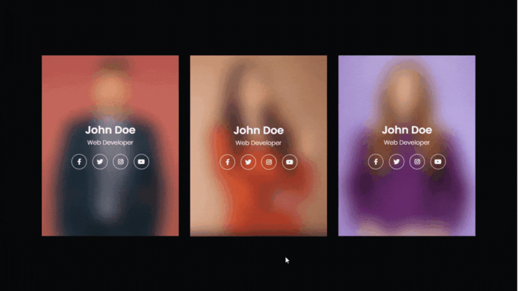
In this responsive team section UI design, you see there are three people with professional photos, names, professions, and social media profile links like Instagram, Facebook, Youtube, and Linkedin.
If you hover your cursor in the pic that shows the picture of that person with a smooth transition and the other pics are still blurred when you remove the cursor it will again blur like other photos.
The best part of the project Is it is also responsive which means you can use all types of devices like mobile, tablet, and laptop. The source code of this project is also available in my GitHub Profile which you can download and use this code.
How To Create a Responsive Team Section Using HTML / CSS
There are some steps to create this type of animated team section using HTML and CSS only that are given below.
- The first step is to create one folder.
- Open this folder in Vs Code Editor and create two files one for HTML and the other one for CSS.
- Make sure the HTML file extension is (.html) and the CSS file extension will be (.css)
- After creating files, you link a CSS file with an HTML file with the help of this line code. (<link rel=”stylesheet” href=”style.css”>)
- The last step is copying and pasting the given code into your files.
Note: I am using three pics in this project you can also download images from Pexels and replaces images other wise your code doesn’t work properly.
Source Code of Responsive Team Section
HTML FILE
<!DOCTYPE html>
<html lang="en">
<head>
    <!-- Created By Coding Pakistan -->
    <meta charset="UTF-8">
    <meta http-equiv="X-UA-Compatible" content="IE=edge">
    <meta name="viewport" content="width=device-width, initial-scale=1.0">
    <title>Animated Team Section Design</title>
    <link rel="stylesheet" href="https://cdnjs.cloudflare.com/ajax/libs/font-awesome/6.4.0/css/all.min.css">
    <link rel="stylesheet" href="style.css">
</head>
<body>
    <section class="team">
        <div class="container">
            <div class="team-items">
                <div class="team-item">
                    <img src="user 1.jpg" alt="img">
                    <div class="info">
                        <h3>John Deo</h3>
                        <p>Web Developer</p>
                        <div class="social">
                            <a href="#"> <i class="fab fa-facebook-f"></i> </a>
                            <a href="#"> <i class="fab fa-twitter"></i> </a>
                            <a href="#"> <i class="fab fa-instagram"></i> </a>
                            <a href="#"> <i class="fab fa-youtube"></i> </a>
                        </div>
                    </div>
                </div>

                <div class="team-item">
                    <img src="user 2.jpg" alt="img">
                    <div class="info">
                        <h3>John Deo</h3>
                        <p>Web Developer</p>
                        <div class="social">
                            <a href="#"> <i class="fab fa-facebook-f"></i> </a>
                            <a href="#"> <i class="fab fa-twitter"></i> </a>
                            <a href="#"> <i class="fab fa-instagram"></i> </a>
                            <a href="#"> <i class="fab fa-youtube"></i> </a>
                        </div>
                    </div>
                </div>

                <div class="team-item">
                    <img src="user 3.jpg" alt="img">
                    <div class="info">
                        <h3>John Deo</h3>
                        <p>Web Developer</p>
                        <div class="social">
                            <a href="#"> <i class="fab fa-facebook-f"></i> </a>
                            <a href="#"> <i class="fab fa-twitter"></i> </a>
                            <a href="#"> <i class="fab fa-instagram"></i> </a>
                            <a href="#"> <i class="fab fa-youtube"></i> </a>
                        </div>
                    </div>
                </div>
            </div>
        </div>
    </section>
</body>
</html>
CSS FILE
*{
    margin: 0;
    padding: 0;
    box-sizing: border-box;
}
body{
    font-family: sans-serif;
    font-weight: 300;
    font-size: 16px;
    background-color: hsl(240, 8%, 4%);
}
.container{
    max-width: 1170px;
    margin: auto;
    padding: 0 15px;
}
/* Team */

.team{
    padding: 80px 0;
}
.team-items{
    display: grid;
    grid-template-columns: repeat(3, 1fr);
    gap: 30px;
}
.team-item{
    position: relative;
    line-height: 1.5;
    color: hsl(0, 0%, 100%);
}
.team-item img{
    width: 100%;
    vertical-align: middle;
}
.team-item .info{
    background-color: hsla(0, 0%,100%,0.05);
    position: absolute;
    bottom: 0;
    left: 0;
    height: 160px;
    width: 100%;
    padding: 15px;
    align-items: center;
    justify-content: center;
    backdrop-filter: blur(20px);
    -webkit-backdrop-filter: blur(20px);
    display: flex;
    flex-direction: column;
    transition: height 0.6s ease;
}
.team-item h3{
    font-size: 28px;
    text-transform: capitalize;
    font-weight: 600;
}
.team-item p{
    text-transform: capitalize;
}
.team-item .social{
    margin-top: 18px;
}
.team-item .social a{
    height: 40px;
    width: 40px;
    border: 1px solid hsl(0, 0%,100%);
    color: hsl(0,0%,100%);
    display: inline-flex;
    justify-content: center;
    align-items: center;
    border-radius: 50%;
    text-decoration: none;
    margin: 0 5px;
}

@media(min-width:992px){
    .team-item .info{
        height: 100%;
    }
    .team-item:hover .info{
        height: 160px;
    }
}
@media(max-width:991px){
    .team-items{
        grid-template-columns: repeat(2, 1fr);
    }
}
@media(max-width:575px){
    .team-items{
        grid-template-columns: repeat(1, 1fr);
    }
}
Video Tutorial – Animated Team Section Using HTML / CSS
If you don’t understand this code and you want to learn in deep so please watch this video and subscribe to this youtube channel for more videos like this.
Related Content
- Periodic Table using HTML and CSS
- Top 10 projects for a Web developer
- Build a movie app using HTML, CSS, and JavaScript
Conclusion
Creating a responsive team section using HTML and CSS can be a great addition to any website. It allows companies to showcase their team members and highlight their expertise while building trust and humanizing their brand.
By using responsive design techniques, the team section can also be optimized for various screen sizes and devices, ensuring that it looks great and functions properly on all platforms.
With a little bit of HTML and CSS knowledge, anyone can create a visually appealing and functional team section for their website.
