
Hi Guys, I am back with another fantastic project using only HTML and CSS. This project is a Card Hover Effect using HTML and CSS. I also share a complete source code with my readers and followers it is free of cost, not any subscription to get the source code of this project.
Recently I shared a 3D flip profile card UI design using HTML and CSS. I also share this source code in the blog post here you can check this 3D flip profile card UI design.
What is Card Hover Effect?
A card hover effect is a design technique used in web development where the appearance or behavior of an element, usually a card, changes when the user hovers their mouse pointer over it.
This effect can be used to add interactivity and visual interest to a webpage, as well as to provide feedback to the user that the element is clickable or interactive.
Common examples of card hover effects include changing the color, size, or position of the card, as well as displaying additional information or images when the user hovers over the card.
About This Project
This project was Created by the Coding Pakistan blog website to help students for free of cost that is learning this type of programming languages, learning web development technologies such as HTML, CSS, JavaScript, React.js, and Next.js.
| Created by | Coding Pakistan |
| Languages | HTML and CSS |
| Responsive | Yes |
| Source Code | Download GitHub |
| Preview | Take Preview |
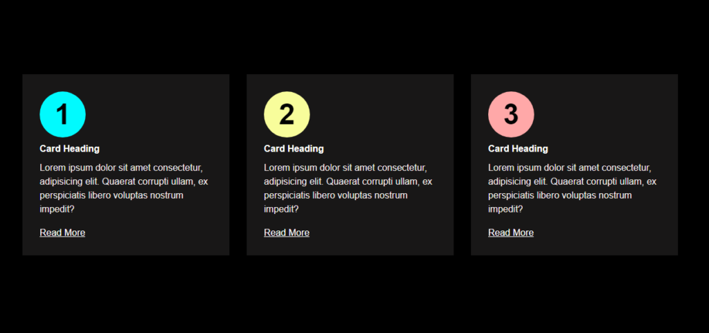
In this Card Hover Effect, you see the background color is black and I have three cards created in the middle of the web page.
The card content is the first number, Heading, some text, and read more button if the user clicked the read more button then it will be redirected to the particular page that you link.
When the user hovers the mouse over any card the circle of the number is moving big and covers all background color with a circle color with a smooth transition that I show in the below picture.

The best part of the project Is it is also responsive which means you can use all types of devices like mobile, tablet, and laptop. The source code of this project is also available in my GitHub Profile which you can download and use this code.
How To Create a Card Hover Effect Using HTML / CSS
There are some steps to create this type of card hover effect using HTML and CSS that are given below.
- The first step is to create one folder.
- Open this folder in Vs Code Editor and create two files one for HTML and the other one for CSS.
- Make sure the HTML file extension is (.html) and the CSS file extension will be (.css)
- After creating files, you link a CSS file with an HTML file with the help of this line code. (<link rel=”stylesheet” href=”style.css”>)
- The last step is copying and pasting the given code into your files.
Source Code of Card Hover Effect
HTML FILE
<!DOCTYPE html>
<html lang="en">

<head>
    <!-- Created by www.codingpakistan.com -->
    <meta charset="UTF-8">
    <meta http-equiv="X-UA-Compatible" content="IE=edge">
    <meta name="viewport" content="width=device-width, initial-scale=1.0">
    <title>Card Hover Effect - Coding pakistan</title>
    <link rel="stylesheet" href="style.css">
</head>

<body>
    <section class="section">
        <div class="container">
            <div class="section-cards">
                <div class="section-card">
                    <span>1</span>
                    <h2>Card Heading</h2>
                    <p>Lorem ipsum dolor sit amet consectetur, adipisicing elit. Quaerat corrupti ullam, ex perspiciatis
                        libero voluptas nostrum impedit?</p>
                    <a href="https://codingpakistan.com/">read more </a>
                </div>
                <div class="section-card">
                    <span>2</span>
                    <h2>Card Heading</h2>
                    <p>Lorem ipsum dolor sit amet consectetur, adipisicing elit. Quaerat corrupti ullam, ex perspiciatis
                        libero voluptas nostrum impedit?</p>
                    <a href="https://codingpakistan.com/">read more </a>
                </div>
                <div class="section-card">
                    <span>3</span>
                    <h2>Card Heading</h2>
                    <p>Lorem ipsum dolor sit amet consectetur, adipisicing elit. Quaerat corrupti ullam, ex perspiciatis
                        libero voluptas nostrum impedit?</p>
                    <a href="https://codingpakistan.com/">read more </a>
                </div>
            </div>
        </div>
    </section>
</body>

</html>
CSS FILE
*{
    margin: 0;
    padding: 0;
    box-sizing: border-box;
}
body{
    font-family: sans-serif;
    font-size: 16px;
    background-color: black;
}
.container{
    max-width: 1170px;
    padding: 0 15px;
    margin: auto;
}
.section{
    padding: 80px 0;
    min-height: 100vh;
    display: flex;
}
.section-cards{
    display: grid;
    grid-template-columns: repeat(3, 1fr);
    gap: 30px;
}
.section-card{
    background-color: rgb(24, 23, 23);
    padding: 120px 30px 30px;
    position: relative;
    z-index: 1;
}
.section-card:nth-child(1){
    --color: hsl(181, 99%, 50%)
}
.section-card:nth-child(2){
    --color: hsl(63, 96%, 80%)
}
.section-card:nth-child(3){
    --color: hsl(0, 100%, 83%)
}
.section-card::before{
    content: '';
    position: absolute;
    left: 0;
    top: 0;
    height: 100%;
    width: 100%;
    background-color: var(--color);
    z-index: -1;
    clip-path: circle(40px at 70px 70px);
    transition: clip-path 1s ease;
}
.section-card:hover:before{
    clip-path: circle(100%);
}
.section-card span{
    position: absolute;
    left: 0;
    top: 0;
    height: 80px;
    width: 80px;
    font-size: 50px;
    font-weight: bold;
    transform: translate(30px, 30px);
    display: flex;
    align-items: center;
    justify-content: center;
    color: black;
    transition: transform 1s ease;
}
.section-card:hover span{
    transform: translate(0, 30px);
}
.section-card h2{
    font-size: 16px;
    color: white;
    font-weight: 600;
    text-transform: capitalize;
    margin-bottom: 10px;
    line-height: 1.3;
}
.section-card p{
    color: rgb(240, 234, 234);
    line-height: 1.5;
}
.section-card a{
    display: inline-block;
    text-transform: capitalize;
    color: white;
    margin-top: 20px;
    font-weight: 500;
}
.section-card a,
.section-card h2,
.section-card p{
    transition: color 1s ease;
}
.section-card:hover a,
.section-card:hover h2,
.section-card:hover p{
    color: black;
}

/* For Responsive Design */

@media(max-width:991px){
    .section-cards{
        grid-template-columns: repeat(2, 1fr);
    }
}
@media(max-width:575px){
    .section-cards{
        grid-template-columns: repeat(1, 1fr);
    }
}
Video Tutorial – Card Hover Effect Using HTML / CSS
If you don’t understand this code and you want to learn in deep so please watch this video and subscribe to this youtube channel for more videos like this.
Related Content
- Responsive Team section Desing using HTML and CSS
- Footer Menu Design using HTML and CSS with source code.
- Build a movie app using HTML, CSS, and JavaScript
Conclusion
Creating card hover effects using HTML and CSS is a great way to enhance the user experience of your website or application.
By adding some simple CSS transitions and hover effects to your cards, you can create visually appealing and interactive elements that capture your user’s attention and provide them with a more engaging experience.
Remember that hover effects are just one tool in your web design toolbox, so be sure to experiment with different effects and find the ones that work best for your specific needs.
With some creativity and a little bit of CSS knowledge, you can take your card design to the next level and create a more dynamic and engaging user interface.
