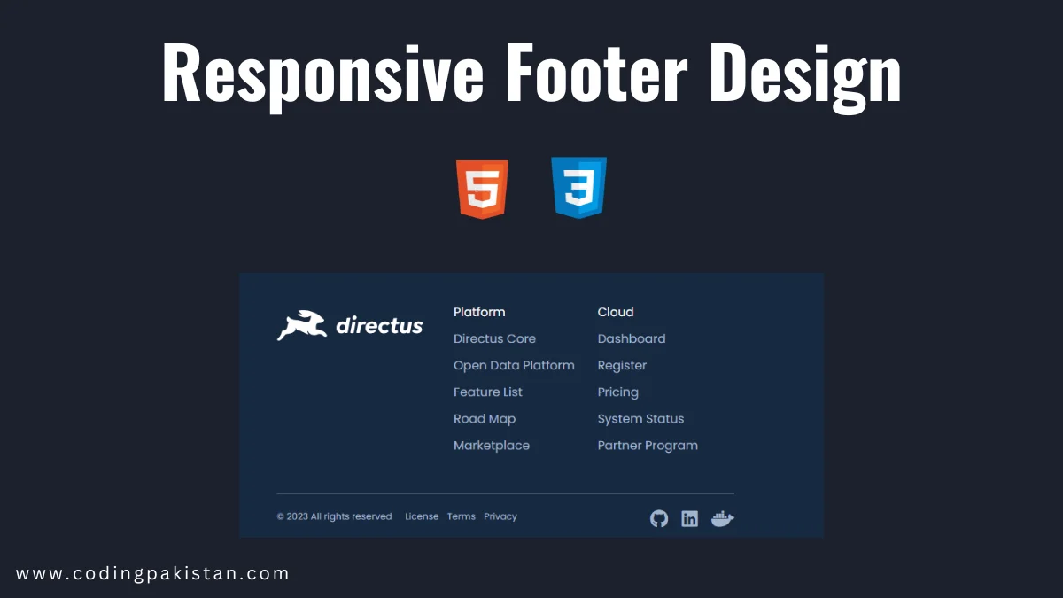
Hi, coders I am back with another fantastic project in this project I created a Responsive Footer Design Using only pure HTML and CSS.
I also share a complete source code with my readers and followers it is free of cost, not any subscription to get the source code of this project. You can download these code files and use them for free.
Responsive Footer Design
A footer in web development is the section of content that appears at the bottom of every page on a website. It typically contains information such as:
- Copyright notice
- Privacy policy
- Sitemap
- Contact information
- Social media icons
- Email sign-up form
- Other links that are relevant to the website
The footer is a great place to put important information that users might need, such as how to contact you or where to find more information about your company. It can also be used to improve the website’s overall usability by providing links to important pages or features.
When designing a footer, it is important to keep it consistent with the rest of the website’s design. The font, colors, and overall style should all match the rest of the page. It is also important to make sure that the footer is easy to read and navigate.
About This Project
This project was created by the codingpakistan team to help students learn coding and programming in a simple way. If you want to join our team please follow us on Instagram.
| Created by | Coding Pakistan |
| Languages | HTML and CSS |
| Source Code | Available Below |
| Preview | Take Preview |
Video
How to Create Responsive Footer Using HTML and CSS
There are some steps to create this type of Footer Design using HTML, and CSS, which are given below.
- The first step is to create one folder.
- Open this folder in Vs Code Editor and create two files in HTML and CSS,
- Make sure the HTML file extension is (.html) and the CSS file extension is (.css).
- After creating files, you link a CSS file with an HTML file with the help of this line code. (<link rel=”stylesheet” href=”style.css”>)
- The last step is copying and pasting the given code into your files.
Responsive Footer – Source Code
HTML FILE
<!DOCTYPE html>
<html lang="en">
  <head>
    <meta charset="UTF-8" />
    <meta http-equiv="X-UA-Compatible" content="IE=edge" />
    <meta name="viewport" content="width=device-width, initial-scale=1.0" />
    <title>Footer 1</title>
    <link
      rel="stylesheet"
      href="https://cdnjs.cloudflare.com/ajax/libs/font-awesome/6.4.0/css/all.min.css"
      integrity="sha512-iecdLmaskl7CVkqkXNQ/ZH/XLlvWZOJyj7Yy7tcenmpD1ypASozpmT/E0iPtmFIB46ZmdtAc9eNBvH0H/ZpiBw=="
      crossorigin="anonymous"
      referrerpolicy="no-referrer"
    />
    <link rel="preconnect" href="https://fonts.googleapis.com" />
    <link rel="preconnect" href="https://fonts.gstatic.com" crossorigin />
    <link
      href="https://fonts.googleapis.com/css2?family=Poppins:wght@400;500;600&display=swap"
      rel="stylesheet"
    />
    <link rel="stylesheet" href="style.css" />
  </head>
  <body>
    <section>
      <footer class="top">
        <img src="logo.svg" />
        <div class="links">
          <div>
            <h2>Platform</h2>
            <a>Directus Core</a>
            <a>Open Data Platform</a>
            <a>Feature List</a>
            <a>Road Map</a>
            <a>Marketplace</a>
          </div>
          <div>
            <h2>Cloud</h2>
            <a>Dashboard</a>
            <a>Register</a>
            <a>Pricing</a>
            <a>System Status</a>
            <a>Partner Program</a>
          </div>
        </div>
      </footer>
      <footer class="bottom">
        <div class="legal">
          <span> © 2023 All rights reserved </span>
          <a> License </a>
          <a> Terms </a>
          <a> Privacy </a>
        </div>
        <div class="links">
          <a class="fa-brands fa-github"></a>
          <a class="fa-brands fa-linkedin"></a>
          <a class="fa-brands fa-docker"></a>
        </div>
      </footer>
    </section>
  </body>
</html>
CSS FILE‘
body {
    margin: 0;
    background: linear-gradient(172deg, #6644ff 50%, #ff99dd 300%);
    font-family: "Euclid Circular A", "Poppins";
    color: #f7f7f7;
  }

  html,
  body {
    height: 100%;
  }

  section {
    position: fixed;
    left: 0;
    bottom: 12px;
    width: 100%;
    background: #172940;
    padding-top: 60px;
  }

  footer {
    display: flex;
    align-items: flex-start;
    gap: 40px;
    margin: 0 30px;
  }

  @media (width < 620px) {
    footer {
      flex-direction: column;
    }

    footer.bottom {
      gap: 16px;
      flex-direction: column-reverse;
    }
  }

  footer > img {
    margin-top: 10px;
  }

  @media (width >= 620px) {
    footer {
      margin: 0 auto;
      max-width: 600px;
      padding: 0;
    }
  }

  footer {
    color: #a2b5cd;
  }

  footer.top {
    border-bottom: 2px solid #3a4f6a;
    padding-bottom: 20px;
  }

  footer.bottom {
    padding: 20px 0;
    justify-content: space-between;
  }

  footer.top .links {
    display: grid;
    grid-template-columns: repeat(2, 1fr);
    gap: 30px;
  }

  .links > div {
    display: grid;
    gap: 10px;
    margin-bottom: 30px;
  }

  footer h2 {
    margin: 0;
    font-size: 16px;
    font-weight: 400;
    color: #f7f7f7;
  }

  .legal {
    font-size: 12px;
  }

  .legal > a {
    margin: 0 4px;
  }

  .legal > span {
    margin-right: 10px;
  }

  footer.bottom .links {
    display: flex;
    gap: 18px;
  }

  footer.bottom .links > a {
    font-size: 24px;
  }

  @media (width < 420px) {
    footer {
      text-align: center;
      align-items: center;
    }

    footer.top .links {
      grid-template-columns: 1fr;
    }

    footer.bottom {
      align-items: center;
    }

    .legal > span {
      display: block;
      margin-right: 0;
      margin-bottom: 2px;
    }
  }
